Efficient Excel Dashboards
Excel Dashboards: Creating Interactive and Dynamic Reports
Are you tired of sifting through rows and rows of data, trying to make sense of it all? Do you want to create interactive and dynamic reports that will impress your boss, colleagues, and clients? Look no further than Excel dashboards!
In this comprehensive guide, we’ll take you on a journey through the world of Excel dashboards. From the basics to advanced techniques, we’ll cover it all. By the end of this article, you’ll be an Excel dashboard pro, ready to create stunning reports that will take your data analysis to the next level.
What is an Excel Dashboard?
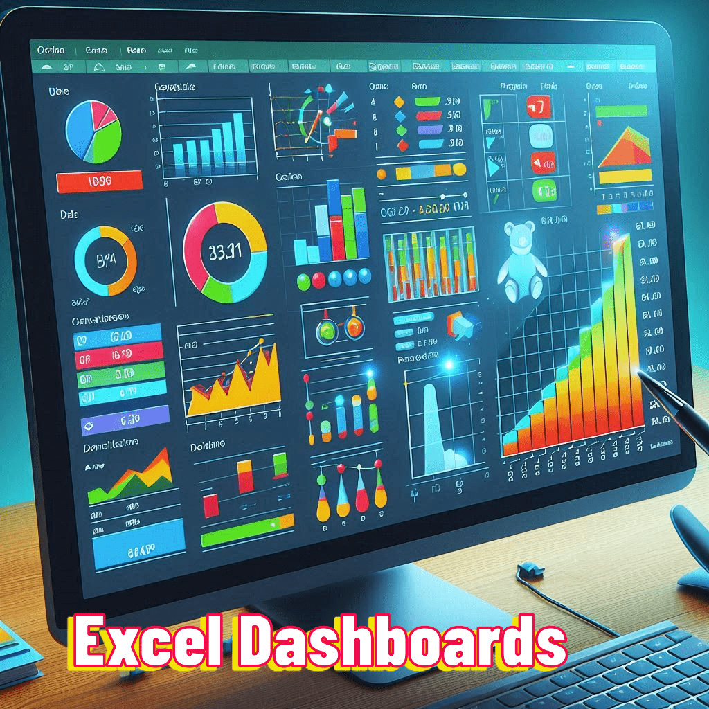
An Excel dashboard is a visual representation of data that provides a quick and easy way to analyze and understand complex information. It’s like a control panel for your data, allowing you to monitor and analyze your data in real-time.

Why Use Excel Dashboards?
So, why should you use Excel dashboards? Here are just a few reasons:
- Data analysis made easy: Excel dashboards make it easy to analyze large datasets, even if you’re not a data expert.
- Fast and efficient: With Excel dashboards, you can quickly create reports that would take hours to create manually.
- Interactive and dynamic: Excel dashboards are interactive and dynamic, allowing you to drill down into your data and analyze it from different angles.
Components of an Excel Dashboard
Here are the key components of an Excel dashboard:
- Charts and graphs: Visual representations of data that provide a quick and easy way to analyze and understand complex information.
- Tables and lists: Used to display detailed data and provide a quick and easy way to analyze and understand complex information.
- Filters and slicers: Used to filter and slice your data, allowing you to analyze it from different angles.
- KPIs and metrics: Used to track and measure key performance indicators and metrics.
Creating an Excel Dashboard
Now that we’ve covered the basics, let’s dive into creating an Excel dashboard!
Step 1: Plan Your Dashboard
The first step in creating an Excel dashboard is to plan your dashboard. This involves identifying your goals and objectives, as well as the data you want to analyze.
Step 2: Design Your Dashboard
Next, design your dashboard. This involves creating a layout that is easy to use and understand.
Step 3: Add Charts and Graphs
Add charts and graphs to your dashboard to provide a visual representation of your data.
Step 4: Add Tables and Lists
Add tables and lists to your dashboard to display detailed data.
Step 5: Add Filters and Slicers
Add filters and slicers to your dashboard to filter and slice your data.
Step 6: Add KPIs and Metrics
Add KPIs and metrics to your dashboard to track and measure key performance indicators and metrics.
Tips and Tricks for Creating Excel Dashboards
Here are some tips and tricks for creating Excel dashboards:
- Keep it simple: Avoid clutter and keep your dashboard simple and easy to use.
- Use colors effectively: Use colors to highlight important trends and insights.
- Choose the right chart type: Choose a chart type that best suits your data and message.
- Avoid 3D charts: Avoid using 3D charts, as they can be misleading and difficult to read.
Common Excel Dashboard Mistakes
Even the most experienced Excel users can make mistakes when creating dashboards. Here are some common mistakes to watch out for:
- Too much data: Avoid including too much data in your dashboard, as it can be overwhelming.
- Poor design: Avoid poor design, as it can make your dashboard difficult to use and understand.
- Too many charts: Avoid using too many charts, as it can be overwhelming.
Real-World Scenarios for Excel Dashboards
Here are some real-world scenarios where Excel dashboards can be used:
- Sales analysis: Excel dashboards can be used to analyze sales data, identify trends, and make predictions.
- Financial analysis: Excel dashboards can be used to analyze financial data, identify trends, and make predictions.
- Marketing analysis: Excel dashboards can be used to analyze marketing data, identify trends, and make predictions.
Conclusion
Excel dashboards are a powerful tool in Excel that can help you unlock the secrets of your data and uncover hidden trends and insights. With this comprehensive guide, you now have the skills and knowledge to create stunning dashboards that will impress anyone. Remember to practice, practice, practice, and soon you’ll be an Excel dashboard pro!


